Hello friends! Today SHARE kicked off a brand new website at SHARE.org It’s been a couple of years since we had a website overhaul and in computer years, that’s a lot longer!
My initial reaction is I find it fresh and attractive, familiar yet easier to navigate, even for an old creature of habit like myself.
You can check it out at www.share.org
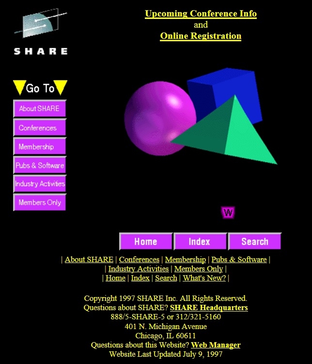
But I started thinking today about how far the SHARE website has come. I decided to check out the wayback time machine at www.archive.org This is a pretty cool site that has capture screenshots of websites over time. It’s interesting to see the trend over the years: Left nav bar, top nav bar, frames, etc. Here’s the oldest I could find, from January 2, 1997:

Pretty snazzy! An interesting black background, bright colors and 3D graphics. The logo is now standard, but why in the world is the color scheme of the website so unrelated to the logo?
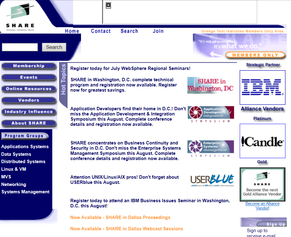
Jump ahead to 6/21/03:

A little bit busy, but relatively bright and clean.
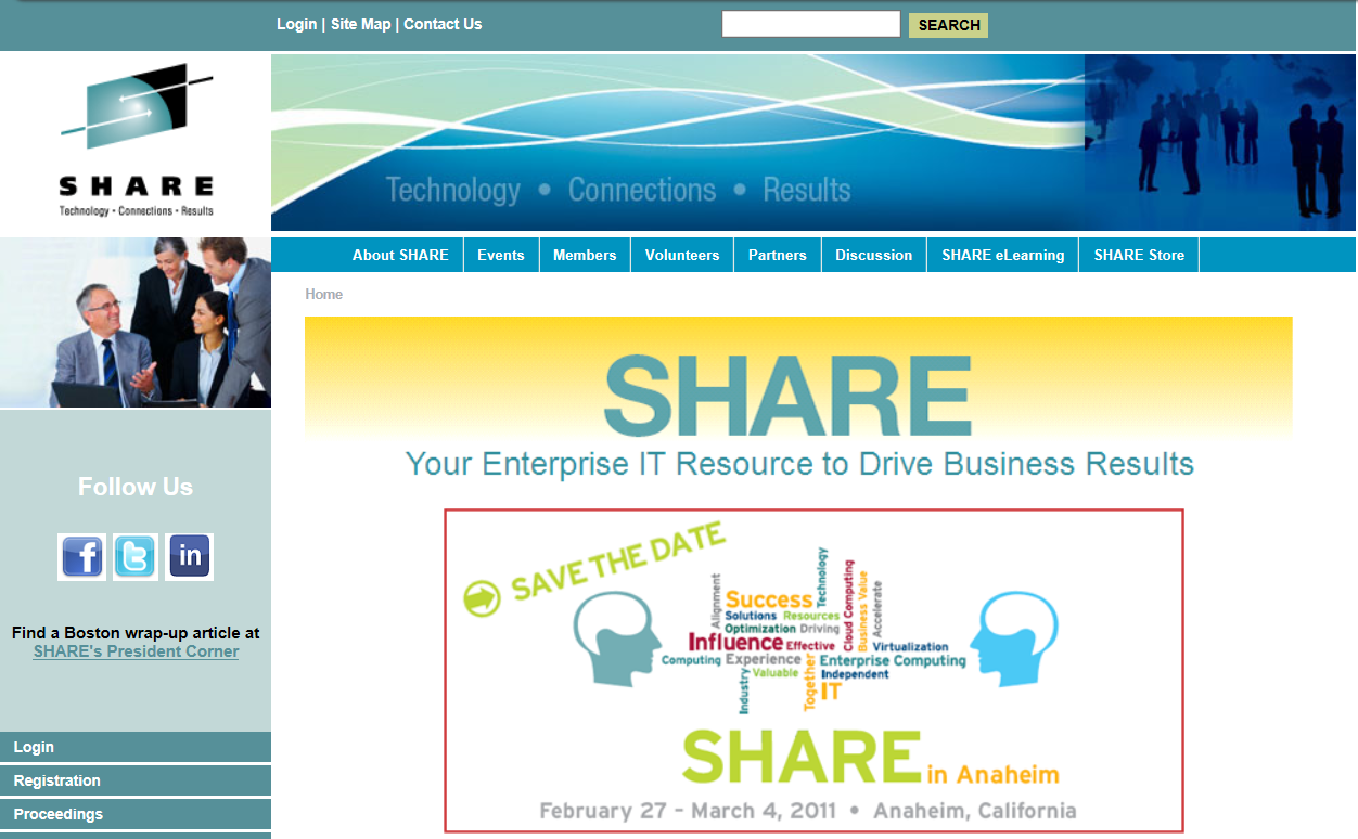
In September 2010, it was:

The banner is more standard, and there are social media links.
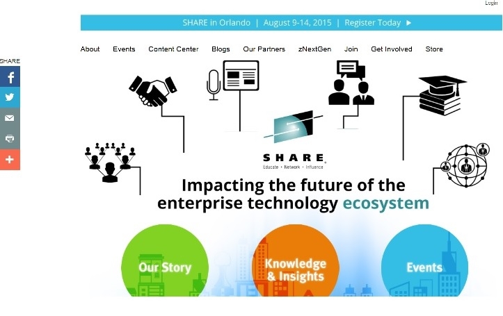
And now today’s:

I think the text in the top banner could be a little more crisp, but other than that it’s very nice; clean, clear and with a contemporary style.
And then 60 years caught my eye and I wandered to the next topic, celebrating 60 years of SHARE. A great blog idea. And a SHARE in Orlando preview, leading off with some great keynote speakers is another idea for a blog. But I still have to finish that dang Seattle blog. Maybe I’ll do that today. Maybe not.
Your link today is to the internet archive at archive.org, and the 1996 version of ibm.com
https://web.archive.org/web/19961022175210/http://www.ibm.com/
Have a great day!
Mary Anne

z/OSSYgirl